Jules Verne was one of the earliest science fiction writers, but what if he were alive today? US SciFi Art Now readers who enjoyed our steampunk chapter, which featured work by artists such as Patrick J. Jones, Bill McConkey and Vicky Stonebridge, might want to check out an exhibition running until May in Foxboro, Massachusetts, which puts a steampunk spin on Verne's Captain Nemo, the submariner in 20,000 Leagues Under the Sea.
Steampunk enthusiasts Steampuffin (www.steampuffin.com) and exhibition creators 5 Wits (www.5-wits.com) have come to together to show people what kind of technology and art could have been on the Nautilus if Nemo was piloting his submarine today.
Think of Steampunk as an alternate reality where the Victorian period happened at the same time as the computer or information age – what would have been produced in modern innovations, inventions and gadgetry. In fact, many believe that Jules Verne was really one of first Steampunk thinkers to popularize the genre.
The 1000-square-foot Nemo's Steampunk Art & Invention Gallery, which will be open until 30th May, will feature primarily museum quality 3D artwork/inventions from Steampunk artists across the country. The artwork will be for sale and can also be customized for clients.
• Check out the Nemo's Steampunk Art & Invention Gallery exhibition, which included details of the artists featured
• Official Exhibition web site: www.5-wits.com/20000leagues.aspx
Friday, 25 March 2011
Friday, 11 March 2011
Do Covers Count when it comes to Awards?
 |
| The UK cover for Zoo City - strong on design, light on its SF content? |
While the stories are obviously the most important aspect of the nominated titles, I was curious to see if there was anything particularly striking about the way the books had been 'packaged'/'marketed' that might have helped them earn well deserved attention.
This year’s six shortlisted titles were selected from a long list of 54 eligible submissions put forward by twenty-two different publishing houses and imprints.
“The twenty-fifth anniversary of the Arthur C. Clarke Award was always going to be a landmark year, and we couldn’t have asked for a more fascinating and exciting shortlist to get the celebrations started," says Award Director Tom Hunter.
“54 eligible books is one of the highest submission years we’ve ever had, and when you look at all of the reviews, debate and online commentary that’s surrounded many of these titles you can see just how hard the judges’ deliberations were this year.
“For me this list is a great indication of just how deep, rich and complex the literature of science fiction can be. I think this list is a definite keeper, as they say, and my hope is that 25 years from now people will still be coming back to it as a representation of everything that’s best about the diversity and strength of our genre.”
The 2011 Arthur C Clarke Award Shortlist
• Zoo City
Zinzi has a talent for finding lost things. To save herself, she’s got to find the hardest thing of all: the truth.
An astonishing second novel from the author of the highly-acclaimed Moxyland.
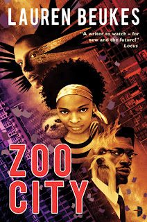 Intriguingly, publishers Angry Robot went for a very different cover for the UK publication (above) to that for the US (left) which, to me, is far more 'traditional" SF and at the very least, features the main character on the cover.
There's some hot debate about how SF and Fantasy is regarded in the UK at the moment - the BBC excised virtually all mention of both genres from their World Book Day programme The Books We Really Read: A Culture Show Special, ironically promoted on iPlayer by a picture of presenter Sue Perkins reading Day of the Triffids. (Author Stephen Hunt, who also runs SF Crowsnest, is up in arms about it, here and here on Facebook).
Such antipathy to SF rather makes me wonder if Angry Robot's marketing department thought long and hard about making the cover look as non-SF as possible to convince British bookshop suppliers to buy copies...
• Lauren Beukes official web site is at: http://laurenbeukes.book.co.za
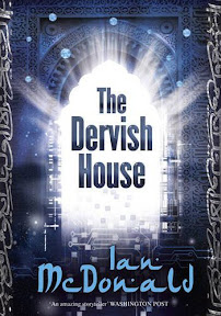 • The Dervish House by Ian McDonald (Gollancz)
In the CHAGA novels Ian McDonald brought an Africa in the grip of a bizarre alien invasion to life, in River of Gods he painted a rich portrait of India in 2047, in Brasyl he looked at different Brazils, past present and future. Ian McDonald has found renown at the cutting edge of a movement to take SF away from its British and American white roots and out into the rich cultures of the world.
The Dervish House continues that journey and centres on Istanbul in 2025. Turkey is part of Europe but sited on the edge, it is an Islamic country that looks to the West. The Dervish House is the story of the families that live in and around its titular house, it is at once a rich mosaic of Islamic life in the new century and a telling novel of future possibilities.
The new SF epic from Ian McDonald does for Turkey what Brasyl did for Brazil.
I really do have to wonder just how much thought went into this cover. Did the designer simply read the Sales Sheet (the overview of the book sent out by publishers to promote the book, notice the word Turkey and Dervish and simply scurry off to find Middle Eastern looking fonts and architecture? Admittedly, the cover does some up the title - but it's pretty dull...
Ian McDonald's official web site is at: http://ianmcdonald.livejournal.com
 • Monsters of Men by Patrick Ness (Walker Books)
“War,” says the Mayor. “At last.” Three armies march on New Prentisstown, each one intent on destroying the others. Todd and Viola are caught in the middle, with no chance of escape. As the battles commence, how can they hope to stop the fighting? How can there ever be peace when they’re so hopelessly outnumbered? And if war makes monsters of men, what terrible choices await? But then a third voice breaks into the battle, one bent on revenge…
The electrifying finale to the award-winning Chaos Walking trilogy, Monsters of Men is a heart-stopping novel about power, survival, and the devastating realities of war.
As you can see from the amazon link, left, the paperback version of the hardcover's cover follows similar lines. Although it's again an illustration light cover, like Dervish House, the design at least captures the title - a tad disturbing and definitely eye catching.
• Generosity by Richard Powers (Atlantic Books)
Generosity is Richard Powers' most exuberantly brilliant book yet, in which he dares to imagine what might happen when science discovers the genes for happiness...
When Russell Stone becomes the teacher of a young Algerian woman with a disturbingly luminous presence, he is both entranced and troubled. How can this refugee from terror radiate such bliss? Is it possible to be so open and alive without coming to serious harm?
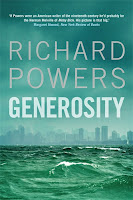
Soon, Thassa’s joyful personality comes to the attention of the notorious geneticist and advocate for genomic enhancement, Thomas Kurton, whose research has enabled him to announce his discovery of the genetic underpinnings of happiness. Thassa’s congenital optimism is severely tested by the growing media circus. Devoured by the public as a living prophecy, her genetic secret will transform both Russell and Kurton, as well as the world at large.
Generosity is Richard Powers' most exuberant and exhilarating book yet.
This cover gets my prize for having absolutely nothing to do with the book description - at least on first glance. Although challenging an artist to come up with a cover that reflects the title was probably a tall order!
The multi-award-winning Richard Powers is probably the most 'maintsream' author on this year's shortlist, a writer whose works often explore the effects of modern science and technology.
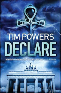 • Declare
An ultra-secret MI6 codename, a deadly game of deception and intrigue - Dark forces from the depths of history. It is the terrible secret at the heart of the cold war. Operation: Declare London, 1963. A cryptic phone call forces ex-MI6 agent Andrew Hale to confront the nightmare that has haunted his adult life: an ultra-secret wartime operation, codenamed Declare.
Operation Declare took Hale from Nazi-occupied Paris to the ruins of post-war Berlin and the trackless wastes of the Arabian desert, culminating in a night of betrayal and mind-shattering terror on the glacial slopes of Mount Ararat. Now, with the Cold War at its height, his superiors want him to return to the mountain and face the dark secret entombed within its icy summit.
Hale has no choice but to comply, for Declare is the key to a conflict far deeper, far colder, than the Cold War itself.
The cover to Declare suits this book by Tim Powers perfectly - he's well known for his secret histories and UK publishers Corvus have captured the spirit of the novel and its themes perfectly - the first UK printing of his 2000 World Fantasy Award-winning spy novel. Powers has a huge following in the US, but his representatives, the Zeno Agency (who, coincidentally, also represent Ian McDonald), cut the UK publishing deal on the back of the success of 'conspiracy' authors like Dan Brown at the end of 2009.
Great to see his work getting wider attention here at last. I still love his early novel, The Anubis Gates released back in the early 1980s.
Tim Powers official website is at: www.theworksoftimpowers.com
 • Lightborn: Seeing is Believing...
Lightborn, better known as 'shine', is a mind-altering technology that has revolutionised the modern world. It is the ultimate in education, self-improvement and entertainment - beamed directly into the brain of anyone who can meet the asking price. But in the city of Los Sombres, renegade shine has attacked the adult population, resulting in social chaos and widespread insanity in everyone past the age of puberty. The only solution has been to turn off the Field and isolate the city.
Trapped within the quarantine perimeter, fourteen-year-old Xavier just wants to find the drug that can keep his own physical maturity at bay until the army shuts down the shine. That's how he meets Roksana, mysteriously impervious to shine and devoted to helping the stricken. As the military invades street by street, Xavier and Roksana discover that there could be hope for Los Sombres - but only if Xavier will allow a lightborn cure to enter his mind. What he doesn’t know is that the shine in question has a mind of its own . . .
Another very stark cover, which pretty much seems to be the norm - strong on typography rather than imagery.
Of the shortlisted, aside from Declare and Generosity, typography and non-SF skewed imagery would appear to be the common factor on all these covers. It's rather sad that despite the high quality of the fiction within, every covers seems intent on disguising the SF contents - although of course, if that helps sales, then sadly that's just how things will continue.
Not great news for the wonderful SF artists I worked with on Sci-Fi Art Now, perhaps?
The Arthur C. Clarke Award is described as the most prestigious award for science fiction in Britain. The annual award is presented for the best science fiction novel of the year, and selected from a shortlist of novels whose UK first edition was published in the previous calendar year.
The Award was originally established by a generous grant from Sir Arthur C. Clarke with the aim of promoting science fiction in Britain, and is currently administered by the Serendip Foundation with Sir Arthur continuing to donate a cash prize via Rocket Publishing, his UK representatives.
Last year's winner was China Miéville for The City and the City, taking the prize for a record third time.
The judging panel for the 2010 Arthur C. Clarke Award are Chris Hill and Jon Courtenay Grimwood for the British Science Fiction Association, Francis Spufford and Rhiannon Lassiter for the Science Fiction Foundation and Paul Skevington for the science fiction news website SFCrowsnest.com. Paul Billinger represents the Arthur C. Clarke Award as the Chair of Judges.
• The winner will be announced on Wednesday 27th April at an award ceremony held on the opening night of the SCI-FI-LONDON Film Festival where a prize of £2011 will be awarded to the winner along with a commemorative engraved bookend.
• Official web site: www.clarkeaward.com
Tuesday, 8 March 2011
Sci-Fi shapes modern design, inspired by TRON
 |
| Image oourtesy of DuPont |
How cool is this as an example of Sci-Fi design shaping the world of around us? The new TRON movie is to be the inspiration for an exhibition illustrating how creativity and innovation meet design at this year's Milan Design Week (11-17th April 2011), considered the most important venue for interior design professionals around the world.
DuPont Corian and Disney will showcase TRON designs CORIAN, an exhibition inspired by TRON: Legacy released last year.
The exhibition organisers say the overall effect and expression of TRON: Legacy has inspired many artists and designers across fashion, music, design and technology. From the original Daft Punk soundtrack, to exclusive apparel and designer jewellery, to the videogame Tron: Evolution, just like the ground-breaking original movie released in 1982, the world of TRON has become a lifestyle phenomenon.
The exhibition is an original project which will be art directed by DuPont and Disney and created using DuPont Corian advanced surface. (DuPont says that if you can imagine it, you can probably create it with Corian; available in over 100 colours, it can be carved, routed or worked like wood, moulded, thermoformed or inlayed… the design options are almost limitless).
A series of leading and trendy companies, architects and designers will also create fascinating interior design solutions and architectural forms as part of the exhibition, taking inspiration from the film and exploiting the versatility of DuPont Corian.
"Disney fosters imagination and DuPont shapes materials," says says Tim McCann, president of DuPont Building Innovations. "We are extremely pleased to be working with a partner as creative and innovative as The Walt Disney Company and develop together with them an exhibition for an important venue like the Milan week of design.
“TRON: Legacy has been a wonderful source of inspiration: combined with the expertise of Disney and DuPont Corian and the collaboration of imaginative architects, designers and companies, it will materialise into a unique, original and fresh exhibition that will surprise the demanding global audience of visitors to the Milan week of design."
Founded in 1800, DuPont, again considered one of the United States 100 Best Corporate Citizens this year, has long been involved in film and film making (as far back as 1924!) as well as developments in science and technology, as this archive advertisement featuring the lunar Apollo mission of the 1970s illustrates (20 of the 21 layers of the Apollo moon suits either contained or were made entirely of science-based innovations developed by DuPont).
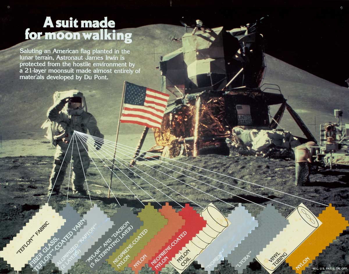 |
| Image oourtesy of DuPont |
• Full Milan Design Week Press Release here on ASC Info
• Milan Design Week 2011 web site (I think!)
• View a fact sheet about DuPont products that have played a critical role in the US space program (PDF)
• Suited for Space (Facebook Page)
Smithsonian-sponsored Facebook page works in tandem with the content from their 2010 traveling exhibit "Suited for Space," giving visitors some extra goodies as they walk through the gallery.
Tuesday, 1 March 2011
Sci-Fi Art Now Creator Interview: Nelson Evergreen
 |
| Flight of the Cosmic by Nelson Evergreen |
"I'm just finishing off a couple of book covers at the moment," he tells us. 'Robbie Forester & The Outlaws of Sherwood St for Penguin, and A Tale Dark & Grimm for Andersen Press.
"I’ve also got a heap of kids’ picture and comic book ideas piled up in the corner, screaming 'Hoi! You! Develop us!' morning noon and night!"
Sci-Fi Art Now: What tools do you mainly use to create your art?
Nelson Evergreen: Pencil and paper (cheap printer stuff, nothing too fancy), Photoshop & Wacom tablet.
Sci-Fi Art Now: Why?
Nelson: It’s nearly always paper and pencil for composition. I don’t care too much for being chained to the computer while working out where to place all the elements. It’s much better being able to wander about, plonking the paper down as and when and just scribbling. Moving around seems to help keep the ideas flowing.
But once everything’s where it needs to be, there’s nothing quite like Photoshop for the rendering. Photoshop is pretty much my favourite thing ever. I always loved analogue inking, but years of doing it in real life, with actual mapping nibs and actual inks and all that sort of variable, fickle nonsense, had reduced me to a hollow wreck of a man. Digital inking is more like sketching with a pencil; looser, freer, less tense. Plus you can jump from medium to medium at the click of an icon.
 |
| Red Riding Hood illustration by Nelson Evergreen |
Sci-Fi Art Now: What inspired you to become an artist?
Nelson: I never had a chance to imagine being anything else! Once I was old enough to realise that all these comics I loved so much were being drawn by grown ups, and that those grown ups were making a (kind of) living from doing so, well, that was it.
Sci-Fi Art Now: Which artists most inspire you?
Nelson: 2000AD was year zero for me, and I was especially smitten with Brian Bolland’s work. He wasn’t a spiky, off the wall stylist like Mike McMahon or Kevin O’Neill, but his ability to convey character, and his exquisite way with composition and pacing, inspired me no end. 2000AD really was a bomb going off – a comic so rammed with wonderful writers and artists that I feel guilty for only mentioning three of them.
A quick list of current names who continue to blow me away include Jamie Hewlett, Dave McKean, Paul Pope, Simon Bartram, Shaun Tan, Todd Schorr, Jon Foster, Charles Burns, Chris Riddell… Plus, a whole horde of old timers like Samuel Palmer, Arthur Rackham, Edmund Dulac, Kathe Kollwitz, Honore Daumier, Gustav Klimt, Goya, Vermeer, Ingres…
Plus all the amazing artists you discover being shamelessly brilliant on the web every single day. I get severely kicked up the backside at least a dozen times a week.
 |
| 'Built with a Smile' by Nelson Evergreen |
Sci-Fi Art Now: What is the appeal to you of science fiction as an inspiration for some of your work?
Nelson: It’s a blank canvas for un-tethered invention. You’ve got scope for mad organisms, freewheeling alien technology, all sorts of shiny, strange unlikeliness, making it a great conduit for automatic brain/hand/paper tomfoolery. I really enjoy not being quite sure what’s going to emerge. Plus, because I get bored of researching real life stuff pretty quickly, the more I can grab straight from my head the better.
Sci-Fi Art Now: Do you have a favourite piece of work or project you have worked on?)
 |
| © Nelson Evergreen |
Leaving aside all the stuff I’ve got in development at the moment, on of the things I had in recent years was working on a pitch for The DFC (David Fickling’s defunct – or rather, hopefully just resting – weekly British childrens’ comic). The strip was about a 10-year-old boy going about his day to day business, blissfully unaware of this hectic universe of anthropomorphic cartoon cells going about their business inside him.
From the outset I got carried away and decided I was going to depict his innards as a cross between a random psychedelic alien environment, Judge Dredd’s Mega City One, and The Simpsons’ Springfield, all rendered in a pseudo animated CGI blockbuster style.
Of course, if I’d paid proper attention to Pixar’s Golden Rule, I’d have remembered to get the script absolutely right before launching into production – given how absurdly long these pages took, that’s not as outlandish a comparison as it might sound! But three years on, I’m still really pleased with how the visuals worked out. There was real love put into them, and I hope that comes across.
Sci-Fi Art Now: In your career, have you had any bizarre experiences while creating your art ?
Nelson: Friends and colleagues sometimes crop up in my pictures by accident. It’s weird to think of all that incredibly precise visual info floating vaguely around up there in your head, never accessible when you want it but always ready to pop out and say hello when you least expect it.
Sci-Fi Art Now: What most frustrates you about being an artist?
My inner critic, without a doubt. Lax when he should be strict, strict when he should be lax. I’d sack him if he wasn’t attached.
Sci-Fi Art Now: What keeps you going despite the hopefully occasional frustrations?
Those moments when you realise you’ve broken out of a stylistic straitjacket you didn’t even know you were wearing.
 Sci-Fi Art Now: What advice would you offer to anyone starting out as an artist?
Nelson: From a creative point of view, work out what you’re best at, push it in public, and work on your weaknesses behind closed doors. From a professional point of view, just try and be a pleasure to work with.
• Check out more of Nelson's work at www.nelson-evergreen.com or his blog at http://nelson-evergreen.blogspot.com. You can contact Nelson via nelson_evergreenAThotmail.com
Subscribe to:
Posts (Atom)