 |
| The UK cover for Zoo City - strong on design, light on its SF content? |
While the stories are obviously the most important aspect of the nominated titles, I was curious to see if there was anything particularly striking about the way the books had been 'packaged'/'marketed' that might have helped them earn well deserved attention.
This year’s six shortlisted titles were selected from a long list of 54 eligible submissions put forward by twenty-two different publishing houses and imprints.
“The twenty-fifth anniversary of the Arthur C. Clarke Award was always going to be a landmark year, and we couldn’t have asked for a more fascinating and exciting shortlist to get the celebrations started," says Award Director Tom Hunter.
“54 eligible books is one of the highest submission years we’ve ever had, and when you look at all of the reviews, debate and online commentary that’s surrounded many of these titles you can see just how hard the judges’ deliberations were this year.
“For me this list is a great indication of just how deep, rich and complex the literature of science fiction can be. I think this list is a definite keeper, as they say, and my hope is that 25 years from now people will still be coming back to it as a representation of everything that’s best about the diversity and strength of our genre.”
The 2011 Arthur C Clarke Award Shortlist
• Zoo City
Zinzi has a talent for finding lost things. To save herself, she’s got to find the hardest thing of all: the truth.
An astonishing second novel from the author of the highly-acclaimed Moxyland.
 Intriguingly, publishers Angry Robot went for a very different cover for the UK publication (above) to that for the US (left) which, to me, is far more 'traditional" SF and at the very least, features the main character on the cover.
There's some hot debate about how SF and Fantasy is regarded in the UK at the moment - the BBC excised virtually all mention of both genres from their World Book Day programme The Books We Really Read: A Culture Show Special, ironically promoted on iPlayer by a picture of presenter Sue Perkins reading Day of the Triffids. (Author Stephen Hunt, who also runs SF Crowsnest, is up in arms about it, here and here on Facebook).
Such antipathy to SF rather makes me wonder if Angry Robot's marketing department thought long and hard about making the cover look as non-SF as possible to convince British bookshop suppliers to buy copies...
• Lauren Beukes official web site is at: http://laurenbeukes.book.co.za
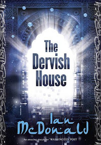
 • The Dervish House by Ian McDonald (Gollancz)
In the CHAGA novels Ian McDonald brought an Africa in the grip of a bizarre alien invasion to life, in River of Gods he painted a rich portrait of India in 2047, in Brasyl he looked at different Brazils, past present and future. Ian McDonald has found renown at the cutting edge of a movement to take SF away from its British and American white roots and out into the rich cultures of the world.
The Dervish House continues that journey and centres on Istanbul in 2025. Turkey is part of Europe but sited on the edge, it is an Islamic country that looks to the West. The Dervish House is the story of the families that live in and around its titular house, it is at once a rich mosaic of Islamic life in the new century and a telling novel of future possibilities.
The new SF epic from Ian McDonald does for Turkey what Brasyl did for Brazil.
I really do have to wonder just how much thought went into this cover. Did the designer simply read the Sales Sheet (the overview of the book sent out by publishers to promote the book, notice the word Turkey and Dervish and simply scurry off to find Middle Eastern looking fonts and architecture? Admittedly, the cover does some up the title - but it's pretty dull...
Ian McDonald's official web site is at: http://ianmcdonald.livejournal.com
 • Monsters of Men by Patrick Ness (Walker Books)
“War,” says the Mayor. “At last.” Three armies march on New Prentisstown, each one intent on destroying the others. Todd and Viola are caught in the middle, with no chance of escape. As the battles commence, how can they hope to stop the fighting? How can there ever be peace when they’re so hopelessly outnumbered? And if war makes monsters of men, what terrible choices await? But then a third voice breaks into the battle, one bent on revenge…
The electrifying finale to the award-winning Chaos Walking trilogy, Monsters of Men is a heart-stopping novel about power, survival, and the devastating realities of war.
As you can see from the amazon link, left, the paperback version of the hardcover's cover follows similar lines. Although it's again an illustration light cover, like Dervish House, the design at least captures the title - a tad disturbing and definitely eye catching.
• Generosity by Richard Powers (Atlantic Books)
Generosity is Richard Powers' most exuberantly brilliant book yet, in which he dares to imagine what might happen when science discovers the genes for happiness...
When Russell Stone becomes the teacher of a young Algerian woman with a disturbingly luminous presence, he is both entranced and troubled. How can this refugee from terror radiate such bliss? Is it possible to be so open and alive without coming to serious harm?

Soon, Thassa’s joyful personality comes to the attention of the notorious geneticist and advocate for genomic enhancement, Thomas Kurton, whose research has enabled him to announce his discovery of the genetic underpinnings of happiness. Thassa’s congenital optimism is severely tested by the growing media circus. Devoured by the public as a living prophecy, her genetic secret will transform both Russell and Kurton, as well as the world at large.
Generosity is Richard Powers' most exuberant and exhilarating book yet.
This cover gets my prize for having absolutely nothing to do with the book description - at least on first glance. Although challenging an artist to come up with a cover that reflects the title was probably a tall order!
The multi-award-winning Richard Powers is probably the most 'maintsream' author on this year's shortlist, a writer whose works often explore the effects of modern science and technology.
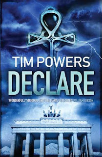
 • Declare
An ultra-secret MI6 codename, a deadly game of deception and intrigue - Dark forces from the depths of history. It is the terrible secret at the heart of the cold war. Operation: Declare London, 1963. A cryptic phone call forces ex-MI6 agent Andrew Hale to confront the nightmare that has haunted his adult life: an ultra-secret wartime operation, codenamed Declare.
Operation Declare took Hale from Nazi-occupied Paris to the ruins of post-war Berlin and the trackless wastes of the Arabian desert, culminating in a night of betrayal and mind-shattering terror on the glacial slopes of Mount Ararat. Now, with the Cold War at its height, his superiors want him to return to the mountain and face the dark secret entombed within its icy summit.
Hale has no choice but to comply, for Declare is the key to a conflict far deeper, far colder, than the Cold War itself.
The cover to Declare suits this book by Tim Powers perfectly - he's well known for his secret histories and UK publishers Corvus have captured the spirit of the novel and its themes perfectly - the first UK printing of his 2000 World Fantasy Award-winning spy novel. Powers has a huge following in the US, but his representatives, the Zeno Agency (who, coincidentally, also represent Ian McDonald), cut the UK publishing deal on the back of the success of 'conspiracy' authors like Dan Brown at the end of 2009.
Great to see his work getting wider attention here at last. I still love his early novel, The Anubis Gates released back in the early 1980s.
Tim Powers official website is at: www.theworksoftimpowers.com
 • Lightborn: Seeing is Believing...
Lightborn, better known as 'shine', is a mind-altering technology that has revolutionised the modern world. It is the ultimate in education, self-improvement and entertainment - beamed directly into the brain of anyone who can meet the asking price. But in the city of Los Sombres, renegade shine has attacked the adult population, resulting in social chaos and widespread insanity in everyone past the age of puberty. The only solution has been to turn off the Field and isolate the city.
Trapped within the quarantine perimeter, fourteen-year-old Xavier just wants to find the drug that can keep his own physical maturity at bay until the army shuts down the shine. That's how he meets Roksana, mysteriously impervious to shine and devoted to helping the stricken. As the military invades street by street, Xavier and Roksana discover that there could be hope for Los Sombres - but only if Xavier will allow a lightborn cure to enter his mind. What he doesn’t know is that the shine in question has a mind of its own . . .
Another very stark cover, which pretty much seems to be the norm - strong on typography rather than imagery.
Of the shortlisted, aside from Declare and Generosity, typography and non-SF skewed imagery would appear to be the common factor on all these covers. It's rather sad that despite the high quality of the fiction within, every covers seems intent on disguising the SF contents - although of course, if that helps sales, then sadly that's just how things will continue.
Not great news for the wonderful SF artists I worked with on Sci-Fi Art Now, perhaps?
The Arthur C. Clarke Award is described as the most prestigious award for science fiction in Britain. The annual award is presented for the best science fiction novel of the year, and selected from a shortlist of novels whose UK first edition was published in the previous calendar year.
The Award was originally established by a generous grant from Sir Arthur C. Clarke with the aim of promoting science fiction in Britain, and is currently administered by the Serendip Foundation with Sir Arthur continuing to donate a cash prize via Rocket Publishing, his UK representatives.
Last year's winner was China Miéville for The City and the City, taking the prize for a record third time.
The judging panel for the 2010 Arthur C. Clarke Award are Chris Hill and Jon Courtenay Grimwood for the British Science Fiction Association, Francis Spufford and Rhiannon Lassiter for the Science Fiction Foundation and Paul Skevington for the science fiction news website SFCrowsnest.com. Paul Billinger represents the Arthur C. Clarke Award as the Chair of Judges.
• The winner will be announced on Wednesday 27th April at an award ceremony held on the opening night of the SCI-FI-LONDON Film Festival where a prize of £2011 will be awarded to the winner along with a commemorative engraved bookend.
• Official web site: www.clarkeaward.com
Joey Hifi is the cover designer for the South African edition of Zoo City, artwork which was then licensed by Angry Robot for the British edition.
ReplyDeleteI don't think his cover is un-sci-fi. It's great design that reflects the tone and feel of the book and it's loaded with geektastic easter-eggs that hint at important moments in the story (Like the profile of the girl's face at the top left of the first O or using Hillbrow's High Point towers as the Marabou stork's beak on the back cover )
Joey, like me, is a tremendous SF and horror and comics fan. (You can check out some of his other work, including this cover for the con-culture memoir Wiffle Lever to Full and the superhero comic-inspired wedding invitation he did for my post-elopement afterparty here http://pocko.com/pockopeople/portfolio5.php?a=22&c=4)
The way he approaches cover design is to read the book, talk over ideas with the author, ask for references, research what's currently on the shelves and striking cover art in general, and then go away to thoughtfully craft something that will not only graphically represent the novel, but also pop off the shelves.
He doesn't worry about genrefication. He designs the best possible cover for the book that he possibly can.
I think his work is fantastic. It's striking, original, imaginative and surprising and pushes the boundaries of cover design. Surely we need more of that?
Very interesting idea -- and the covers you show suggest that they can be a deciding factor. I have to wonder if, as the publishing industry continues to fragment and more small presses and self-publishing authors start marketing diverse products, book covers will become the new "gate keepers" displaying the potential quality of the title.
ReplyDeleteCertainly this is how I have come to quickly judge the potential quality inside the covers of a book. If the publishing doesn't care enough to put a good cover on a title, chances are they didn't care enough to proof and edit it, and llikely don't feel it has much chance of success.
Covers become the new gate keeper for the buying public ,
Hi Lauren - I do hope I haven't caused you or Joey offence. I wasn't criticizing the quality work on the final covers: I'm just a bit intrigued that the covers for all five books don't look "SciFi". (Not to me, anyway).
ReplyDeleteI certainly understand how much work a good artist puts into their work and Joey clearly does good work.
As you say - boundaries need to be pushed and when we put Sci-Fi Art Now together the brief from ILEX was to ensure it had a 'human' aspect to it -- alongside the expected spaceships and robots!
Oh not at all, please don't worry. My point is that there's as much possibility for range in cover design in SF as there is for content on the pages within.
ReplyDeleteAnd the book looks gorgeous - exactly the kind of thing I used to collect.