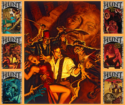
Lee Moyer offers his useful guidance to would be or practicing artists trying to gt their break in the world of commercial art...
I critique hundreds of pieces every year. Not because I'm a Creative Director (although I have been), but because I (like you) am a consumer of art - of illustration, painting, comics, games, et alia. And the act of critique is one of the most helpful for enlarging one's own understanding and formalizing concepts that might otherwise float away...
While the following list is by no means scientific (many of the elements listed below overlay others, and many great paintings use only a few) I made it for my own reference and I hope it will be food for thought.
Print it out and put it by your drafting table or computer if it'll help.
Focus
Where do you want your viewer's eye to go? What's the heart of the piece, the crux of the biscuit?
Composition and Design
Create a visual hierarchy - A path for the viewer to follow? Something fractal? Separate elements intended for book cover, spine and back cover? Consider the surface you're working on, its aspect ratio and how that effects the harmonies and tensions of your piece. When working in a tall oval, or a wide ceiling, or a strange milled form, that's pretty obvious. But it is just as important within a normal rectangle.
Palette
There are many good ones that great painters have applied over the years. Use one of theirs or make your own!
Value
Can your piece be reduced to black and white and still read correctly?
Sometimes good pieces work their value in terms of warm and cool colors, but most need strong tonal variety to read well.
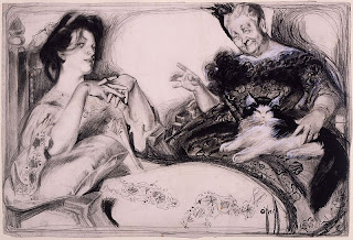 |
| Signs by Rosie O'Neill. |
Mass
Think
Rodin,
JC Leyendecker or
Rose O'Neill.
Texture
It makes things and people seem real.
Symbolism
Personal, classical, mystical or cultural - words, numbers, objects, beings. There's no shortage of sources or end to interpretation as
Michael Kaluta and
Brian Despain are good examples.
Synecdoche (Micro defining Macro)
A small area of tight or implied detail will help define vast shapes - like the windows in a colossal building or the wrinkles on an elephant. One needs the wee bits for versimilitude...
Ornament
Whether it's
Mary Engelbreit's checkerboards, or
Stephen Hickman's ornate orientalism, Ornament matters. Sometimes it's a sort of texture, other times the whole
raison d'etre.
Narrative
Is there a story here? A big idea? A paradigm, a parody, a pastiche? Has the sword been nicked in battle, has the dog been fed, has the sweater been patched?
Norman Rockwell began his pictures thinking of a soldier under a light post and ran scenarios in his mind (often switching "lead" characters) until he found a painting.
Juxtaposition
Comparisons and contrasts of size, scope, meaning, characters... in our world of Zoroastrian black and white contrasts, this is often too-easy. Use discretion and variety.
Stylization
Sometimes it's fetishism for a type of brush-stroke or color scheme, sometimes caricature or anatomy. For example, the best pin-ups (by
Gil Elvgren,
Aly Fell,
Glen Orbik,
et alia) have similarly stylized elements, some of which might surprise you.
If you're working on a pin-up, just crack their code and you're off to the races.
Character
Have the characters lived real lives? Are they real beings with hopes and fears? Body language, gesture and costume are crucial here.
Tension
Gesture is important, but so is the feeling of tension. Sometimes it's the most important part of a piece. Drama, high stakes, suspense. If you can enlist the viewer's sympathy support or curiosity, you win.
Line
It's quite obvious in the works of
Franklin Booth,
Aubrey Beardsley, and
Mike Mignola - but don't underestimate its importance for
Drew Struzan,
Arthur Rackham or
John Jude Palencar.
Research/Reference
I know precious few people who draw brilliantly out of their heads, but those heads have absorbed the lessons their eyes have shown them for many years. Most of us have been nowhere near as observant, and while we may remember and be able to imagine many things, there are usually areas where we fall down. Bolster yourself and your work with reference. Don't stick slavishly to it, but make it do your bidding.
Vignette
The play of shape (whether silhouette or fully rendered form) against a white, colour, or fully realized background is so important for keeping a viewer interested.
Perspective
Each point in perspective applies to a single dimension (in 2 point perspective the points are nearly always width and depth). Get perspective right and you'll be halfway home. Also, the more you keep you POV away from a normal grid as seen from 6', the more dynamic your piece will be.
FUN!
A certain
joie de vivre is key. It doesn't matter if you paint supplely or with technical perfection - If you don't bring some fun and adventure to your work, viewers can tell. They won't always know what's wrong, but they'll get that something is...
To which list the delightful
Kurt Huggins suggested:
Process: This is your way of managing and editing all of these different elements. Each step of your process should be about solidifying one more element of the image, building up to a final piece. There are many processes, and many ways to finish, but I think most processes start with idea or composition.
• More of Lee's work at www.leemoyer.com
• Read our interview with Lee Moyer
This article © 2008 Lee Moyer. Used here with permission


 provides a seminal course covering all the techniques needed to master drawing the figure. Hailed by the American Academy of Art as “one of the
most brilliant contributions that figure drawing has ever received”
Loomis’s book is packed with beautiful examples to help you master
anatomy and capture the human form at any age, in movement and at rest.
provides a seminal course covering all the techniques needed to master drawing the figure. Hailed by the American Academy of Art as “one of the
most brilliant contributions that figure drawing has ever received”
Loomis’s book is packed with beautiful examples to help you master
anatomy and capture the human form at any age, in movement and at rest. 
 , also released last year, offer a masterclasses in tackling what comic artists often find the most difficult elements in figure
drawing, but world-class illustrator Andrew Loomis’s classic primer
offers plenty of solutions.
, also released last year, offer a masterclasses in tackling what comic artists often find the most difficult elements in figure
drawing, but world-class illustrator Andrew Loomis’s classic primer
offers plenty of solutions.
 - a superb resource covering all the techniques needed to master three-dimensional drawing that has been many an artist's bible for 60 years. From the fundamentals of proportion, placement, perspective, planes and pattern, through a detailed examination of scale and the effects and capture of light, to the mastery of conception, construction, contour, character and consistency, Successful Drawing is filled with step-by-step instruction, professional tips and beautiful illustration.